Showing posts with label graphic design. Show all posts

Tuesday, January 1, 2013

Off To An Awesome Start!

So, I thought I wouldn't have much design to report until a couple weeks from now, but then I found THIS! Alt.kilt has made an awesome red kilt for Atlas the Mighty in Circus Bacchus with my logo on it! Best ever!

New Years has started out completely wrong in the diet department. However, having eaten nothing but junkfood all day, I am satisfied that all need for pizza and potato chips has left me. I look forward to all the pretty fruits in my fridge. I have 2 kinds of mangos, a prickly pear and 3 different kinds of apples and pears! Oh! And persimmons!

Sea of Dreams was tons of fun! I had a really great time. The venue was HUGE! I'd love to go to an event there again. Very well laid out and easy to navigate, with plenty of room. Room for 4 stages, 2 chill areas, a vendor village and galleries! They even had a few food trucks outside. Once again, Mexican food saved my life. And there was literally a bar in every area to keep you from getting thirsty.

It was my 4th time seeing Gogol Bordello live and they were hugely impressive as always. If you have never seen them live, do it. They put on one of the best, most energetic shows I have ever seen. They are consistently awesome.


Shpongle was Shpongle, always a joy. I had seen that particular set before and it was pretty cool. They did the Quixotic Masquerade show this time. It has just been too hard to gain enough room to really dance at all of their shows! Tragic, but I continue to dream of larger dance floors!


And then there was The Glitch Mob. Sorry everyone, but I have rarely been so underwhelmed. I really appreciate their energy and their showmanship was awesome! It's just that I really hated their music. It was terrible. The sound was abrasive, too much contrast between the trebles and the bass, and absolutely nothing in the middle to connect them. It sounded like they should have been making beats for hip-hop, not putting on their own act. But I digress, I'm an electronica snob, so please feel free to judge for yourself. I see potential here, the reggae style beats and some of the rhythmic structure was good, but the musicality was under par. Feel free to have a look at them though, great performers.

Trentemoler was pretty cool, but I was too busy watching another DJ to pay him much attention. All the headliners were great, but the highlight of my night was Dex Stakker, who was spinning some sick, dirty breakbeat trance until midnight. He even shared my distain for 2012 declaring, "Fuck 2012!" as midnight approached. Made my night. : ) He rocked my whole world for a good 90 minutes. So awesome! I waited until the end of his set and told him how impressed I was and he gave me a CD of his vocal mix (and it ROCKS). Totally want to see more of him this year.


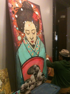
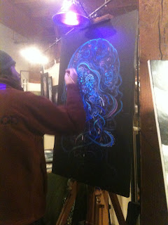
Also, there was a gallery of artworks, a display of different kinds of kinetic/interactive installations involving lots of lights and projectors, and live artists working on paintings! One had a figure model sign-up sheet. Hopefully I'll be hearing back. : )


Also, I have to mention the awesome circus performance by CirQularius and the fabulous samba interludes by Samba Drop. Great fun and great acts!

Last night, I had a dream that I was living in an apartment complex that might have been Arcosanti in my dreamscape. The handyman was completely unreliable due to alcohol addiction and I covertly stole his tools to do the work myself, replacing them when I had finished. I also needed to pick locks to get some of the work done and I remember gaining some practice locks and some picks to play with before I woke up. Interesting insights for a new year. Apparently I have all the tools, I just need to figure out how to use them. Sounds about right.

Monday, December 24, 2012

The wrong things WERE important...

And now it's nearly a year later.

I've always been a terrible blogger, but if you read this, you know that already.

So, what's changed...

I ended up in San Francisco. I'm living with the first boyfriend I've had since High School and another guy who's turned out to be an awesome friend. I have 2 other women I'm dating as well. I had a job at Minted as a Print Quality Specialist. But it was only a seasonal contract. I'm unemployed and trying to hang onto my sanity while looking for work and not being able to do much else due to financial constraints.

That's the abridged version of the story.

This blog is going to be taking a new direction. I'm not sure where yet.

There is so much going on in my life that has absolutely nothing to do with art or design that I think this blog will have to be... Just more.

I tried really hard to keep this blog professional, but I think the time for that is over. What good is a symphony if it's only made of violins?

So on to the wonderful timbre of the other myriad instruments.

Stay tuned.

Friday, March 23, 2012

Things I've been thinking about...

I'm an American. As ashamed as I am of that fact sometimes, I don't know anything else. My art needs some direction, and I've been thinking I should stick with what I know. So here's some subjects I've been thinking about.

Dia de los Muertos - I've been conceptualizing a tribute project to all my dearly departed in which I will make a skull portrait of each loved one I have that has passed. And maybe make actual candy skulls to go along with them. Having lived in Tucson for 10 years, this small part of Mexican folk culture has lodged itself in my bones, and I think I would like to explore it further.

American Folklore - Paul Bunyan, Johnny Appleseed, Pecos Bill, Davy Crocket, John Henry, Calamity Jane. Those are the mainstream ones. What others? Where are all the women? Who were they before they became the stuff of legend? Frontiersmen, Cowboys, Ranchers, Lumberjacks, Hobos, Railroaders, and stage coach drivers. Why the romance? What other romantic figures didn't make it into folklore (gangsters, militiamen, other rebels)? Are there any heros that chose harmony with nature instead of overcoming it? And what about our actual historical figures? George Washington didn't want to be president, Abe Lincoln didn't want to free the slaves, Martin Luther King Jr. didn't want to be used as an advocate for lower taxes for the rich... If we were still writing folklore, who would the modern characters be?

Embryos - I need to expand this concept into the political realm. And with all the stink being made about women's reproductive rights lately, that shouldn't be hard.

Immigrants - Unless you are a native American, you're essentially an immigrant. Doesn't matter how long you've been here. Or does it? How long does it take, how many generations, for a person's blood to be tied to the land they live in? Am I an immigrant? Immigrant spawn? Or am I too a native American. The short answer is no, but what is the long answer?

Little ramblings. I feel like I need to expand myself a little in the realm of creativity. I also feel like I need to attach more meaning to my art. What is my message? I'm not sure anymore. After 2 years as a designer, I feel like I'm working for/within a system that I fundamentally disagree with on multiple levels. How do I use my skills to raise my voice within that system? And what do I have to say?

Thursday, January 26, 2012

4 4 U

Birth announcements. They chose the one on the right.

Business card designs for Matt Kesler. He chose the big one with a blank back. The ones in the middle are 1.5"x3.5". I like to call them "skinny" cards. And I'm in love with them. I wish more people would choose them.

Here are some awesome logos that I designed for a student (who failed to pay us).

Business card designs for Brandon Smith at North Peak Photography. He chose the big ones in the middle (front and back).


I think I've mentioned how much I LOVE designing business cards. And I do. Truely. They are wonderful puzzles to solve. And there are so many things you can do with them! Round corners, dye cuts, varying dimensions, different stock weights, coatings, paper colors, foil stamping... Oh my god. At any rate, this is still my favorite kind of design project. Followed closely by logo generation. : )

Here's a question. I have had some designs that I've done that have been redone by others after clients have failed to pay for their design work. The designs are different, but very closely similar to the originals that I was responsible for. I'm having trouble deciding how to feel about these people stealing my ideas and generating bastardized versions of them. Do I have cause to feel jilted? I don't even get paid for my designs (as they are included in the printing costs...) Does anyone have any opinions on the morality (or lack of it) in this situation? I'd love to hear them.

Sunday, January 22, 2012

Weekend Update!

A calendar magnet for my Mom.

Business card designs for The Glazer Law Office. They ended up choosing the one on the left.

And an ad for Frank's Daily Bread Deli.


I had a money hemorrhage today. Glad it's out of my system. : )

Wednesday, January 18, 2012

Day 83

Or something like that.

I'll admit, it's basic, but here it is! I designed the back, my co-worker did the front.


Tuesday, January 17, 2012

Lies!

Oops, that lasted less than a week. So you get 6 today!

Here are business card designs for Dais. They chose the top left one.

This is a magnet design for the Flagstaff Denim and Diamonds Gala.

This is the business card I designed for Dent Towing Services.

These are the business cards I designed for The Eagle, a local classic rock station. They chose the horizontal design. (And ordered 3,000 cards printed, and failed to pay us.)

Here are some business card designs and a flier for Epiphany Community School.


Circus Bacchus went to DarkCon in Phoenix and did a show during the event. Both the show and the convention itself were TONS of fun! I got lots of compliments about my trumpeting and the Bacchus Family Band and had a great weekend full of the nerdiest fun ever! I'll definitely be attending that event again.

Update Complete!

Wednesday, January 11, 2012

Day 4

I don't know why I'm numbering my days. : )

Here's a business card I designed for CREC. It was printed on recycled brown paper, which makes all the difference.


Do I want to move to Germany? I'm seriously considering it...

Tuesday, January 10, 2012

Day 3

In addition to just quitting alcohol, I have also accidentally quit smoking. Now, don't freak out. My decision to start again was taken under deep and careful consideration before I began. And now, I think I've gotten whatever it was out of my system. It's a pretty disgusting habit; I'm glad it's over. Besides, e-ciggs are a much brighter alternative.

Cue tangent! Here are two designs for the front of the announcement post card for Alchemy Salon & Spa.

And here's another. And the back.
I know, I know. I said I was only posting 1 per day. But in this case, waiting for the rest of the design would be silly. Enjoy.

Monday, January 9, 2012

Day 2...

Here are business card designs for Alchemy Salon & Spa. Unfortunately, the company no longer exists, but that doesn't mean I didn't do an awesome job on their identity! Yes, I did the logo too. And the pallet. And I gained a fun font into my library called HamburgSymbols. The other font is Anastasia.

On a completely tangent subject, I think I might have accidentally quit drinking forever... Oh well.

Also, I got a Kindle this Xmas and I'm super excited to start loading it up with CRUNCHY LITERATURE!!!!! OMNOMNOM! (And now this...)

Sunday, January 8, 2012

6 or so months pass...

...and nothing much has changed.

Here's a business card and alternate logo I made for 34 Electric and Communications in Flagstaff.

I'll be posting one image per day for the next couple weeks. Each image comes from the span of time that I have been employed at The Print Raven in Flagstaff.

6 months from now, I will be living somewhere else! I've decided that it is time to take my leave of this stifling small town, and actually get paid for my expertise at a more professional organization. I have had a good time up here, met many good friends and had many good times, especially the circus related ones. But it's time to move on. I am growing to hate this place, and that isn't what I want.

Ram Dass is my new guru. If you haven't heard of/listened to him, you ought to. His name was Richard Alpert before his awakening. He is in his 80's now. And my new goal in life is to meet him before he dies. He has beautiful thoughts. And an equally beautiful smile.

Speaking of goals, it's time for new years resolutions! Which I hate. So I've decided to have new year's guidelines instead:
Yoga regularly.
Begin juicing.
Eat more raw foods, veges, salad, fruits, smoothies.
Eat REAL breakfasts in the morning. (By real I mean see above and quit the mini doughnut and mountain dew combo I've been living on for a YEAR almost...)
Control blood sugars. (The docs tell me it will help my joint problems among other things.)
Regular meditation.
More sitting in the sun.
Control inflammatory pain.
More art for me.
Art as activism.
More poetry.
Better general hygene (eew, I know...)
"Be the lover you desire" and then start looking.
All easy guidelines to stick to.

My first plan for moving away is to move to Eugene, OR with my friend Natasha. The second plan is to just apply for jobs in whatever city I feel like going to and see what turns out. I definately need a job before I do any moving. Work cut me to part time, so now I have next to no income. And jobs in Flagstaff are hard to find unless you want to work food or retail. But even then...

I will, however be doing some figure modeling at NAU in February and March. Putting just a little bit of cold hard evil into my savings account for the move.

One last thing, I'm pretty sure I'm an anarchist. I'm also pretty sure I'm a communist. But I'm pretty sure I'm not an anarcho-communist. That community has a tendency toward violence and disrespect that I am not angry enough to get behind yet. I mean, sorry black bloc, but I don't have to believe in private property to respect it or accept people's addiction to it. Breaking windows only demonstrates your anger, it doesn't really make any kind of point beyond that.

Actually, that's not the last thing. The last thing is a "big think" (read The Island of Dr. Moreau). I'm an adult. I can make my life be whatever I want it to be. When I was younger, I used to get discouraged about being stuck in a rut and not being able to change anything. Now, I am seeing that it just takes a little more time than I want it to, and that is the source of my frustration. But, the time is necessary. Time presents the opportunity to grow, plan, change without growing pains, and make easy transitions. One of the things that I will take away from my time in Flagstaff is the ability to appreciate the baby steps in the process to bettering oneself. I have changed a lot since I've been here, and it has been too slow to account for all at once. But looking back on the last 2 years, I can see the progression. And only now does it all begin to make sense and fit together. Patience, as it turns out, is less of a virtue and more of a necessity. People only say it is a virtue because they are victims of their culture, too ADD to sit and wait, contentedly, for an outcome. Maybe patience should be on my list of new year's guidelines.

The end. For now.

Saturday, May 28, 2011

Update

It's finally Spring! No more snow or frosts this year. I've planted squash, beans, and carrots. We'll see how they turn out. I'm hoping to receive tomato plants from my friend Esther once they get big enough. We have mint taking over one of the planters, green onions, sage and cilantro. Good eats!

I'm gearing up for Fairyworlds in Eugene, OR. Natasha, Maria, a few others and I will be manning a booth and selling all manner of wonders and trinkets. There will be art, masks, jewelry, books, clothing and more! Fun for all!

I've been doing a lot of thinking lately, mostly about my current direction. Circus is taking over my life and I didn't want it to, so after this performance season, I'll be scaling it back significantly. The only performing I'll be doing will be with the band. Fire up in Flagstaff is just too much of a hassle. I'll be learning some new and interesting skills like fire meteor, dart, and fire breathing/eating. And I'll be keeping up with the juggling. But just to dabble. Maybe something awesome will come out of these experiments, but I'm not banking on it. I just want to have fun with it. More trumpet, more painting, less stress, happy Kim.

I'll be celebrating my 1 year anniversary in a couple weeks. My how time flies when your in love. : )

I can't wait until my self-imposed 2 years is up on my job. I'm ready to be more creative and actually get paid real money for what I can do.

Diabetes management is improving. I discovered to my dismay that all the ratios in my insulin pump were completely off and I have been working to get things back on track. Vision is improving with my blood sugars, and I've hooked up with an excellent diabetes educator who doesn't scoff at my dreams of curing my disease or participating in clinical trials to that end. The next step is finding a like-minded endocrinologist (a requirement for most of the clinical trials). I think I may be conducting interviews for that position. I really want my new doc to be on board for curing me, not treating me. I have faith.

On the injury front, I've started light work-outs that include stretching, balance and equipment-less exercises (push-ups, crunches, pull-ups, etc.) that use my body as its own weight system. I've decided to track my progress and see how I improve month to month. Maybe I'll be a flier yet! Stretching and moving feels really good. I'm doing it right.

I'm donating a painted adirondack chair to my Mom's Soroptimist Club for a raffle in Phoenix. It's a desert-scape with prickly pear cactus. I'll be painting it today. I had another, more epic idea, but she told me to stick with something simple. Next year, I'll be painting it a Dia de los Muertos theme with a skeleton mother and a skeleton embryo and flowers and bright colors and yay!

Motorcycle, gallery showings and paintings are in the works.

End of line.

Tuesday, December 14, 2010

The Verdict...

...is in.

The neurologist says that I have to keep the brace on until mid January. On the bright side, I'll be able to skip to the front of all the lines at Disneyland.

My trigger finger was helped, but not cured by the first shot. I suspect a second shot is needed. Not thrilled.

This week I'll see another doc about the nodule they found on my thyroid. Hopefully it's nothing. My Mom has one too so I'm not too worried.

I got moved into the big office at work! Now I'm in the room with all the other graphic designers. : ) It's not a promotion or anything like that, they just have room now.

Speaking of work, The Print Raven won Best of Flagstaff this year in the category of "Best Print Shop"! We didn't even advertise for the competition this year and we ended up winning. We rock.

Being back at work is hard on my neck, but I'm settling back into the routine again just fine. The doc told me to only work part time and not to do any lifting or bending. So I'm confined to my desk except for a few production tasks like binding, laminating and copies (as long as they're not heavy once they're done).

I'm looking forward to my move. Lots of painting space. And I have lots of new ideas for art, mostly involving Circus Bacchus publicity and print design. But paintings are coming to me as well. I know I've been complaining that I don't paint enough. I think all the painting space in the new house will fix that. They have a room with a south wall that is mostly windows looking out into a pretty back yard, perfect for natural light.

Lance Horton, the guy with the gallery in Winslow, will be picking up my Brain Babies for display on Wednesday. I can't wait for them to be up again! And I'm stoked that they'll be displayed in a tattoo parlor. That alone makes the distance worth while. The best part is that he's understanding about the car and willing to pick stuff up from me.

Onward and upward and toward the New Year!

Wednesday, October 27, 2010

Artings

The latest creations from my mind-womb!!!!!

"Java Baby"


"Water Baby"


"Oil Baby"


"Monthly."


"Moon Time"

I'm considering these sketches for future paintings. I've made stickers out of most of them. Let me know if you'd like some. : )

Tuesday, October 5, 2010

Creative Design

I don't get to do a lot of creative design at work, but when I do, coolness ensues! Here's what I've done in the last few months:

A postcard for Alchemy Salon & Spa. They didn't want to go with this design and we're still going rounds on the content of the card. I liked this one the best. And I hope to hear back from them soon on the other design I made for them. Once they approve the postcard, I'll get to work on the business card and use the postcard for inspiration.

A Banner for Exchange Club. They adored it! So do I.

This is the card for 103.7 The Eagle in Flagstaff! They loved it. I'll post the final once they approve it. It will have rounded corners and I've made some minor adjustments.

These are a few drafts of the card for RC Optical. I didn't make this logo. I've had this job since June. Their design decisions keep on getting worse and worse... But I live to please. These 4 are all rejects, but they're my favorites.

Thursday, July 22, 2010

Oh clients... (a short rant)

...Why don't you listen to me? I have a degree in making you look good, but you insist that I design sub-par items for you because you think you are better at this than I am. You are silly. Stop it.

So R.T. Henderson and I are working toward creating a business card that utilizes their new logo. They are insisting on scripty, Victorian fonts with photos of a very modern kitchen, greens that clash with the green in their logo, and they want their Victorian font in burgundy... In burgundy and inside of a white box on top of the photo... They also want the format vertical on one side of their card and horizontal on the other... REALLY?!? I'd laugh if I didn't feel like banging my head against my laptop.

I really wish I could present my ideas to them so I can explain why having a specific, limited pallet of fonts and colors is very important to a company's identity. You want customers to associate you with a particular group of fonts and colors, it makes it easier for them to recognize you and separates you from other companies.

That's nitty-gritty. But seriously, I thought everyone knew how to match colors at least! Burgundy + Global Green + Lime Green = NAZTY!

It's little things like this that make me wish that I actually had written contact (at the very least) with the clients that I get to do creative design for. I'd absolutely love to sit down with them over a cup of coffee and go over proofs with them, explaining why I made versions of their card that didn't follow any of their directions but utilized the images and text they gave me. About why using the logotype is better than using a random swishy font to write their company name. And why one should use only one green at a time.

Maybe if I work on my bosses a little, they'll actually let me start sending out proofs so I can write all of these comments diplomatically in an email. I'm really good at being diplomatic when I am trying to persuade people to make good design choices.

That, and they usually end up going with my original suggestions anyway! Why can't we just listen to me the first time?

Oh clients... I love you, but you're silly.

Oh, and we have a vinyl cutter here at work. Life Seed stickers are SO happening! And others, maybe Ouroboros and Life Tree strips.

Saturday, July 10, 2010

Tiny Update

Work is so fun! I get to make things every day!

A company called R.T. Henderson chose my logo out of the ones that the other designers and I sent for proofing. It was the first time my design has been chosen ever! I was super excited about it. Here it is:

I've finally gotten settled enough that I've started working on my own artwork again. And I even got hit up to illustrate a children's book by one of our clients! It's a cute story about a Moose and a Goose and a mystery bird with low self esteem. The mystery bird is very self conscious about the way he looks and is afraid that others don't like him because he is different. By the end, the Moose and the Goose present him in all of his glory to the other animals. The mystery bird is a Peacock and all of the animals crown him king of a festival because he is so delightfully unique and beautiful. Cute story, I'll be getting sketches of that done this coming week if all goes well.

Wow, life is good.

Monday, June 14, 2010

A Tiny Rant About Musical Notation, Graphic Design, and Clip Art

Musical notation is a language. Each note and rest represents a sound (or pause in sound) much like a letter or character represents a sound or syllable. As a musician, I am often frustrated by how artists and graphic designers abuse this language. And don't even get me started on the fictional instruments that populate clip art and canvas alike! I'll save that last point for another entry, for now, let's take a minute to discuss theabuse of musical notation in art.

Here are some basic note and rest values:
Without going into music theory, the above representations are correct in every way! If one were to turn the notes (not the rests) upside down, they would still be correct. The dots are always skewed as they are above, and the flags on the eighth and sixteenth notes always fly to the right:
Notes with flags ALWAYS have solid dots, or have x's instead of dots in the case of percussion.


The above notations are a far cry from this:
What is this? This is musical gibberish. Representations like this are about as ridiculous as making a bunch of random brush strokes on a piece of paper and calling it Chinese. Are those dots without stems and flags whole notes? Why are they all crammed on the page haphazardly? Why are some of the ledger lines purple, combined with their adjacent notes, and others yellow? As a musician, I have no idea. As an artist, I still have no idea.

Here's another example:
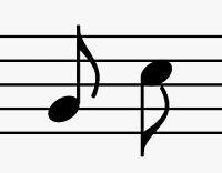
This one also falls under the category of fictitious instruments. Is it a clarinet? An oboe? A soprano sax? It has the attributes of all of them! But look at the notes... The first one checks out, but the one on the right is what I was talking about when I mentioned the fake Chinese earlier. It's gibberish, it means nothing. Obviously it was a sloppy attempt at an eighth note, but really? Some very BASIC research would have fixed this problem.

How about this:
Now, I'll admit that I don't know much about the musical notation associated with percussion, but I have never seen this note before! This is what I got when I googled "eighth note clip art". Unless I was asleep during the entire 14 years I was in school for music, I'm pretty sure this note doesn't exist! It's not a half note, and it's not an eighth note. The only way it could be worse is if it had a dot right after it and the flag was flying the wrong way. I'd describe this as a "half eighth note"... And "half eighth notes" do not exist.

In fact, here's a list of musical notation unique to percussion (click to see the whole thing):
I see no "half-eighth notes" here...

Graphic design is all about communication through imagery. Graphic designers who make unreadable images don't get work. Why, then, do so many designers and artists butcher musical notation? I'll grant that some artists will claim artistic license as a defense for their incorrect musical notation, and graffiti artists often distort text beyond the point of recognition. I respect artistic license and I have a deep love and respect for graffiti art, but even graffiti is readable. And if no artist in their right mind would butcher the beautiful characters of the Chinese language, why should they overlook the equally beautiful language of music?

I'm not saying that artists need to be 100% accurate with their musical notation, but please, one google search is all it takes to keep from embarrassing yourself in front of all of your musically inclined clients. Get a clue, folks. You wouldn't butcher the multitude of Asian, Ancient, Greek, or Cyrillic scripts, so stop making fools out of yourselves and learn what an eighth note looks like.

BTW, UA Presents... You might want to run your program artwork through a College of Music filter next year. Not to diss the artist, but this is EXACTLY what I'm talking about.

Wednesday, June 2, 2010

Insulin > Internet

Posts will continue to be few and far between for a while. I don't think I'm going to be able to afford internet for quite some time, but I'll try to update when I can.

I now work at The Print Raven in Flagstaff. I'll be doing graphic design and print production for them. I LOVE IT! Seriously, it's way fun and I actually don't wince at the idea of a normal schedule with this job. My bosses literally have to kick me out at closing time because I get so absorbed that I forget to check the clock! Totally digging it.

As far as my personal work, I'm just now getting unpacked to the point of starting work again. I'll write about it as it happens. Flagstaff is very inspiring, and I'll be talking to galleries about displaying my work soon. "First Fridays" is this week and there'll be gallery openings. Hopefully I'll be able to network a little.

My computer battery sucks, gotta go now. : )

Sunday, May 16, 2010

Long Awaited Update

  • I'm about to move back to Flagstaff
  • I got a job doing graphic design and print production for Print Raven
  • I finished Randy's shirts!
  • I've been insanely busy with modeling and packing
  • I'm totally on schedule with the move
  • Art will be on hold until I've settled in
  • Blogging for real will resume after I move in
Woot! Seriously, I'm running on pitas and geek beer. Insanity is neigh.