Saturday, July 24, 2010

Life Seed Stickers!


LIFE SEED STICKERS!!!!! In GOLD and GREEN and WHITE!!!!!

The gold is about 3 inches and the green and white have 3 and 4 inch versions.

Want some? Lemme know.

Thursday, July 22, 2010

Oh clients... (a short rant)

...Why don't you listen to me? I have a degree in making you look good, but you insist that I design sub-par items for you because you think you are better at this than I am. You are silly. Stop it.

So R.T. Henderson and I are working toward creating a business card that utilizes their new logo. They are insisting on scripty, Victorian fonts with photos of a very modern kitchen, greens that clash with the green in their logo, and they want their Victorian font in burgundy... In burgundy and inside of a white box on top of the photo... They also want the format vertical on one side of their card and horizontal on the other... REALLY?!? I'd laugh if I didn't feel like banging my head against my laptop.

I really wish I could present my ideas to them so I can explain why having a specific, limited pallet of fonts and colors is very important to a company's identity. You want customers to associate you with a particular group of fonts and colors, it makes it easier for them to recognize you and separates you from other companies.

That's nitty-gritty. But seriously, I thought everyone knew how to match colors at least! Burgundy + Global Green + Lime Green = NAZTY!

It's little things like this that make me wish that I actually had written contact (at the very least) with the clients that I get to do creative design for. I'd absolutely love to sit down with them over a cup of coffee and go over proofs with them, explaining why I made versions of their card that didn't follow any of their directions but utilized the images and text they gave me. About why using the logotype is better than using a random swishy font to write their company name. And why one should use only one green at a time.

Maybe if I work on my bosses a little, they'll actually let me start sending out proofs so I can write all of these comments diplomatically in an email. I'm really good at being diplomatic when I am trying to persuade people to make good design choices.

That, and they usually end up going with my original suggestions anyway! Why can't we just listen to me the first time?

Oh clients... I love you, but you're silly.

Oh, and we have a vinyl cutter here at work. Life Seed stickers are SO happening! And others, maybe Ouroboros and Life Tree strips.

Saturday, July 10, 2010

Tiny Update

Work is so fun! I get to make things every day!

A company called R.T. Henderson chose my logo out of the ones that the other designers and I sent for proofing. It was the first time my design has been chosen ever! I was super excited about it. Here it is:

I've finally gotten settled enough that I've started working on my own artwork again. And I even got hit up to illustrate a children's book by one of our clients! It's a cute story about a Moose and a Goose and a mystery bird with low self esteem. The mystery bird is very self conscious about the way he looks and is afraid that others don't like him because he is different. By the end, the Moose and the Goose present him in all of his glory to the other animals. The mystery bird is a Peacock and all of the animals crown him king of a festival because he is so delightfully unique and beautiful. Cute story, I'll be getting sketches of that done this coming week if all goes well.

Wow, life is good.

Monday, June 14, 2010

A Tiny Rant About Musical Notation, Graphic Design, and Clip Art

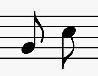
Musical notation is a language. Each note and rest represents a sound (or pause in sound) much like a letter or character represents a sound or syllable. As a musician, I am often frustrated by how artists and graphic designers abuse this language. And don't even get me started on the fictional instruments that populate clip art and canvas alike! I'll save that last point for another entry, for now, let's take a minute to discuss theabuse of musical notation in art.

Here are some basic note and rest values:
Without going into music theory, the above representations are correct in every way! If one were to turn the notes (not the rests) upside down, they would still be correct. The dots are always skewed as they are above, and the flags on the eighth and sixteenth notes always fly to the right:
Notes with flags ALWAYS have solid dots, or have x's instead of dots in the case of percussion.


The above notations are a far cry from this:
What is this? This is musical gibberish. Representations like this are about as ridiculous as making a bunch of random brush strokes on a piece of paper and calling it Chinese. Are those dots without stems and flags whole notes? Why are they all crammed on the page haphazardly? Why are some of the ledger lines purple, combined with their adjacent notes, and others yellow? As a musician, I have no idea. As an artist, I still have no idea.

Here's another example:
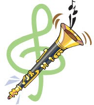
This one also falls under the category of fictitious instruments. Is it a clarinet? An oboe? A soprano sax? It has the attributes of all of them! But look at the notes... The first one checks out, but the one on the right is what I was talking about when I mentioned the fake Chinese earlier. It's gibberish, it means nothing. Obviously it was a sloppy attempt at an eighth note, but really? Some very BASIC research would have fixed this problem.

How about this:
Now, I'll admit that I don't know much about the musical notation associated with percussion, but I have never seen this note before! This is what I got when I googled "eighth note clip art". Unless I was asleep during the entire 14 years I was in school for music, I'm pretty sure this note doesn't exist! It's not a half note, and it's not an eighth note. The only way it could be worse is if it had a dot right after it and the flag was flying the wrong way. I'd describe this as a "half eighth note"... And "half eighth notes" do not exist.

In fact, here's a list of musical notation unique to percussion (click to see the whole thing):
I see no "half-eighth notes" here...

Graphic design is all about communication through imagery. Graphic designers who make unreadable images don't get work. Why, then, do so many designers and artists butcher musical notation? I'll grant that some artists will claim artistic license as a defense for their incorrect musical notation, and graffiti artists often distort text beyond the point of recognition. I respect artistic license and I have a deep love and respect for graffiti art, but even graffiti is readable. And if no artist in their right mind would butcher the beautiful characters of the Chinese language, why should they overlook the equally beautiful language of music?

I'm not saying that artists need to be 100% accurate with their musical notation, but please, one google search is all it takes to keep from embarrassing yourself in front of all of your musically inclined clients. Get a clue, folks. You wouldn't butcher the multitude of Asian, Ancient, Greek, or Cyrillic scripts, so stop making fools out of yourselves and learn what an eighth note looks like.

BTW, UA Presents... You might want to run your program artwork through a College of Music filter next year. Not to diss the artist, but this is EXACTLY what I'm talking about.

Wednesday, June 2, 2010

Insulin > Internet

Posts will continue to be few and far between for a while. I don't think I'm going to be able to afford internet for quite some time, but I'll try to update when I can.

I now work at The Print Raven in Flagstaff. I'll be doing graphic design and print production for them. I LOVE IT! Seriously, it's way fun and I actually don't wince at the idea of a normal schedule with this job. My bosses literally have to kick me out at closing time because I get so absorbed that I forget to check the clock! Totally digging it.

As far as my personal work, I'm just now getting unpacked to the point of starting work again. I'll write about it as it happens. Flagstaff is very inspiring, and I'll be talking to galleries about displaying my work soon. "First Fridays" is this week and there'll be gallery openings. Hopefully I'll be able to network a little.

My computer battery sucks, gotta go now. : )

Sunday, May 16, 2010

Long Awaited Update

  • I'm about to move back to Flagstaff
  • I got a job doing graphic design and print production for Print Raven
  • I finished Randy's shirts!
  • I've been insanely busy with modeling and packing
  • I'm totally on schedule with the move
  • Art will be on hold until I've settled in
  • Blogging for real will resume after I move in
Woot! Seriously, I'm running on pitas and geek beer. Insanity is neigh.

Sunday, April 4, 2010

Happy Zombie Jesus Day!

I've discovered that I've inadvertently taken up a collection of glass energy drink containers... I have 5. It's weird. I might continue the trend. Oh, and Bawls G33K B33R is the best root beer EVAR!

I'm listening to "Life of Pi" on audio book while knitting and/or bookbinding. I learned to pearl and knit all at once so I can make a proper scarf. Art has slowed down a little bit. But I'm still sketching and I have until May to wrap up all the little projects that I need to before moving.

The list is:
Trella (a character of my sister's)
The Elements (yes, still not done)
Oracle + Black Canary (because they rock)
Maisie + Siobhan (a vampire and ghoul for the game I play)
Galena (another vampire for game)
Tribute Tattoo (back piece)
White Knight's Family Crest (for a raver and his rave family)
Randy's stenciled shirts (still have to cut and spray them)
3 more embryos
Fetus de Milo

I've had my downtime. Now time to work again.